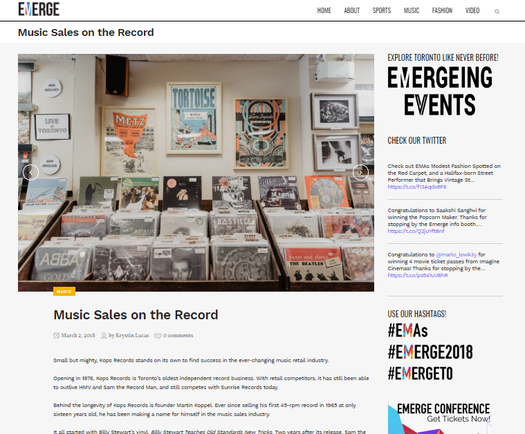
Emerge Web Magazine 2018
EmergeTO is a large, innovative cross-collaboration media project led by fourth-year media studies students of all disciplines. Emerge Magazine and the Emerge Web Magazine’s focus in 2018 was on the success of individuals in music, sports, and fashion in the Greater Toronto Area.
Role in Project
- Web Design Team Lead
- Lead WordPress Developer

Emerge Web Magazine was a collaborative effort between program specializations.
My team consisted of six web designers in total. I was also the liaison for the web magazine journalism team. This does not include the countless other graphic designers, photographers, videographers, journalism writers, sponsored/branded content writers, and editors that made Emerge Web Magazine 2018 so successful.

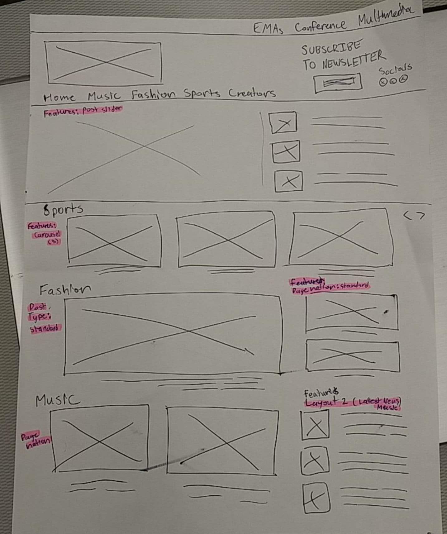
Homepage Wireframe Draft

The Web Design Team’s Scope

- Choosing and customizing a responsive WordPress Theme with highly responsive dev support
- Designing the website’s layouts, integrating accessibility and responsiveness
- Researching, installing, and updating appropriate plug-ins
- Search Engine Optimization (SEO), tracking analytics, and maintaining the website by troubleshooting issues
- Creating an outlet for journalism students to post, edit, and publish articles, and giving technical support where possible
- Creating pages, categories, and space for media content
- Providing guidelines for size dimensions and requirements to photographers and other creatives
Out Of Our Scope
• Producing written content and articles
• Social media and advertising content
• Producing photographs, graphics, and video
• Editing photographs, graphics, and video
• Creating and maintaining partner sites such as: Emerge Media Awards, Emerge Conference, and other University of Guelph-Humber websites

Goals Met in This Project

- Clear Project Plan. Being organized and setting expectations at the beginning. Delegating tasks to the graphic designers really helped take the load off of the web team. Creating instructional guides for content writers, posting schedules, and contact lists added clearer communication.
- Website Accessibility. We added accessible buttons to alter the webpage visuals for those who are visually impaired or need a dark mode. We made sure alt descriptions fit the guidelines and there was a clear tabbing order as well. Updated note: We understand that accessibility buttons absolutely do not replace accessibility best practices for a website, and this was just an extra feature we added ON TOP OF using design best practices.
- Brand Awareness. Opened and expanded our audience to other institutions. Better search results from improved SEO by adding alt descriptions, clear text hierarchy, keywords, better layouts, etc.
- Better UX. As a team, we did more research on user experience. Having an easy-to-follow magazine theme with basic menu tabs created easier navigation. Improved our information architecture by creating magazine sections on the homepage. Easy to navigate, share, and comment on the article pages.
- Regular Feedback. Meeting with our faculty advisor regularly to get feedback. We also did a site launch feedback survey and sent it to all Media Studies students. Surveys were available online and on paper.

Awards
First Place – 2019 EMA Award for best University web magazine or newssite
Finalist – The Associated Collegiate Press (ACP) Pacemaker Award for online broadcast, news, and magazine site